Series, Improving Content Discovery
Series, Improving Content Discovery
Series, Improving Content Discovery
As the Senior UX Designer and Lead Product Manager, I led the end-to-end redesign of the Series app to address declining new-content discovery. I owned the full process—from early research and problem framing to UX design, product direction, launch, and post-launch iteration.

Product
Naver Webtoon, Series
Naver Webtoon,
Series
Platform
Mobile & Tablet App
Role
Sr. UX Designer & Product Manager
Sr. UX Designer
Product Manager
Project Duration
Jan - Jul. 2024
Naver Webtoon, Series
Mobile & Tablet App
Sr. UX Designer, PM
Jan - Jul. 2024
Project Summary
Project Summary
Problems
New-content discovery was declining. Users kept relying on Recently Viewed, revealing issues in our recommendation logic and information hierarchy.
Goals
Redesign discovery by improving the recommendation structure and information hierarchy, helping users find new content faster without disrupting habits.
Result & Impact
Discovery efficiency improved: +29.5% clicks, +14.7% new-content views, +11.5% purchases, validating the new recommendation system.
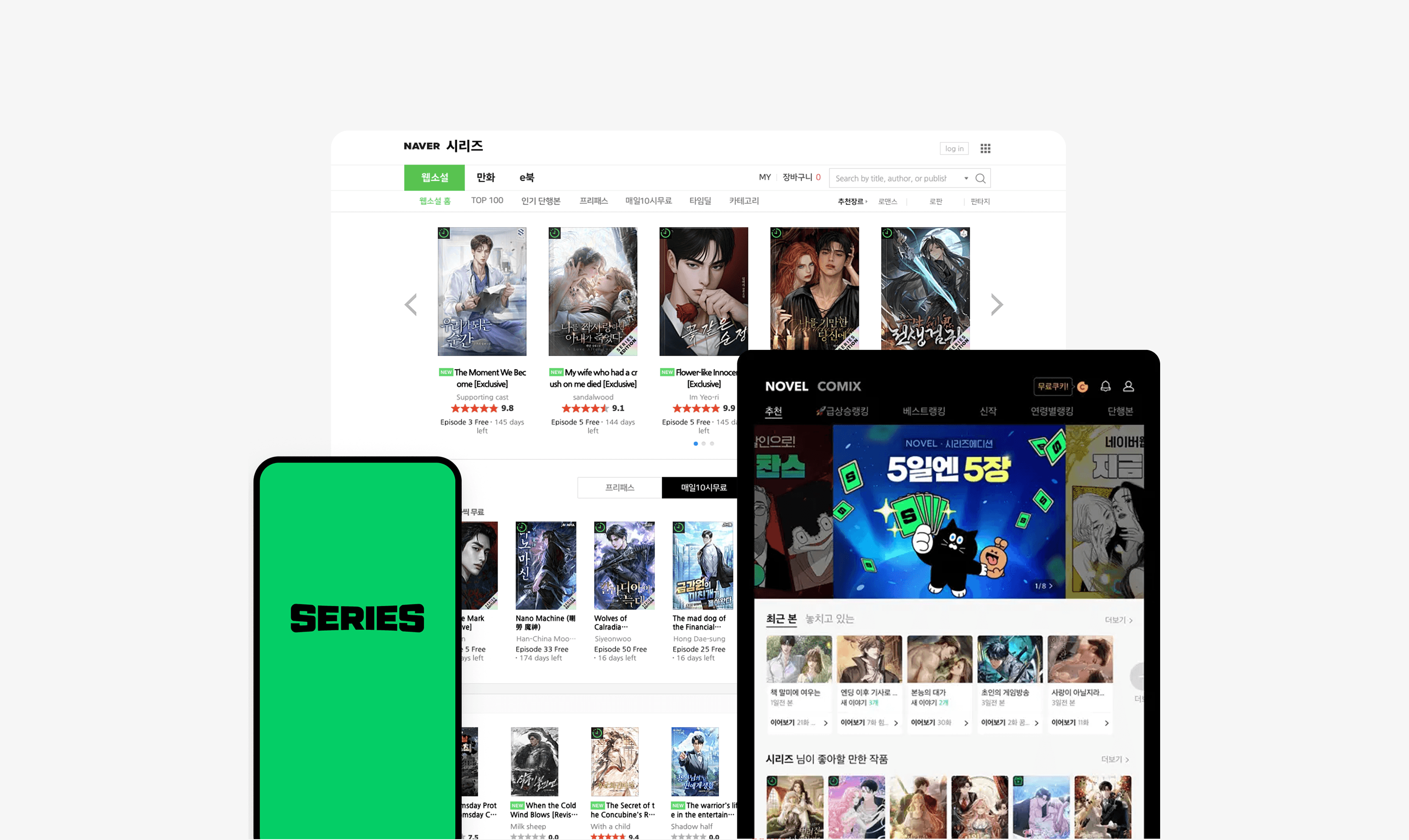
About Naver Series
About Naver Series
Naver Series is one of Korea’s largest platforms for web comix and novels, serving 2.5M+ MAU and 120K+ contents. Because new-content discovery directly drives retention and revenue, improving this experience has a critical business impact.
Naver Series is one of Korea’s largest platforms for web comix and novels, serving 2.5M+ MAU and 120K+ contents. Because new-content discovery directly drives retention and revenue, improving this experience has a critical business impact.
Problems : Limited new content discovery
Problems : Limited new content discovery
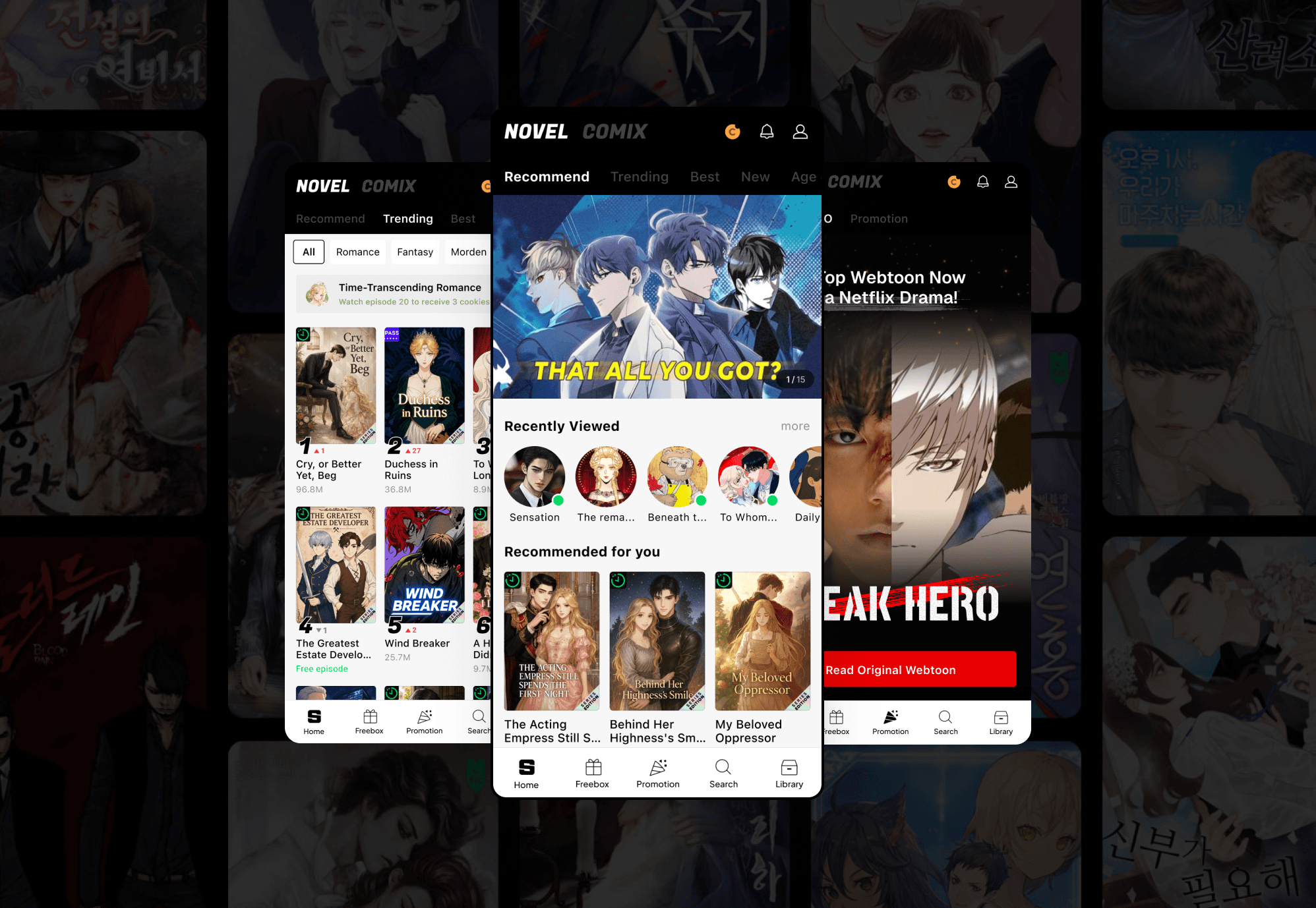
History-Focused Home Structure
With 72% of Home activity concentrated in Recently Viewed, new content became nearly invisible. The history-driven layout kept users locked into what they were already reading, making new-title exploration extremely rare.
History-Focused Home Structure
With 72% of Home activity concentrated in Recently Viewed, new content became nearly invisible. The history-driven layout kept users locked into what they were already reading, making new-title exploration extremely rare.
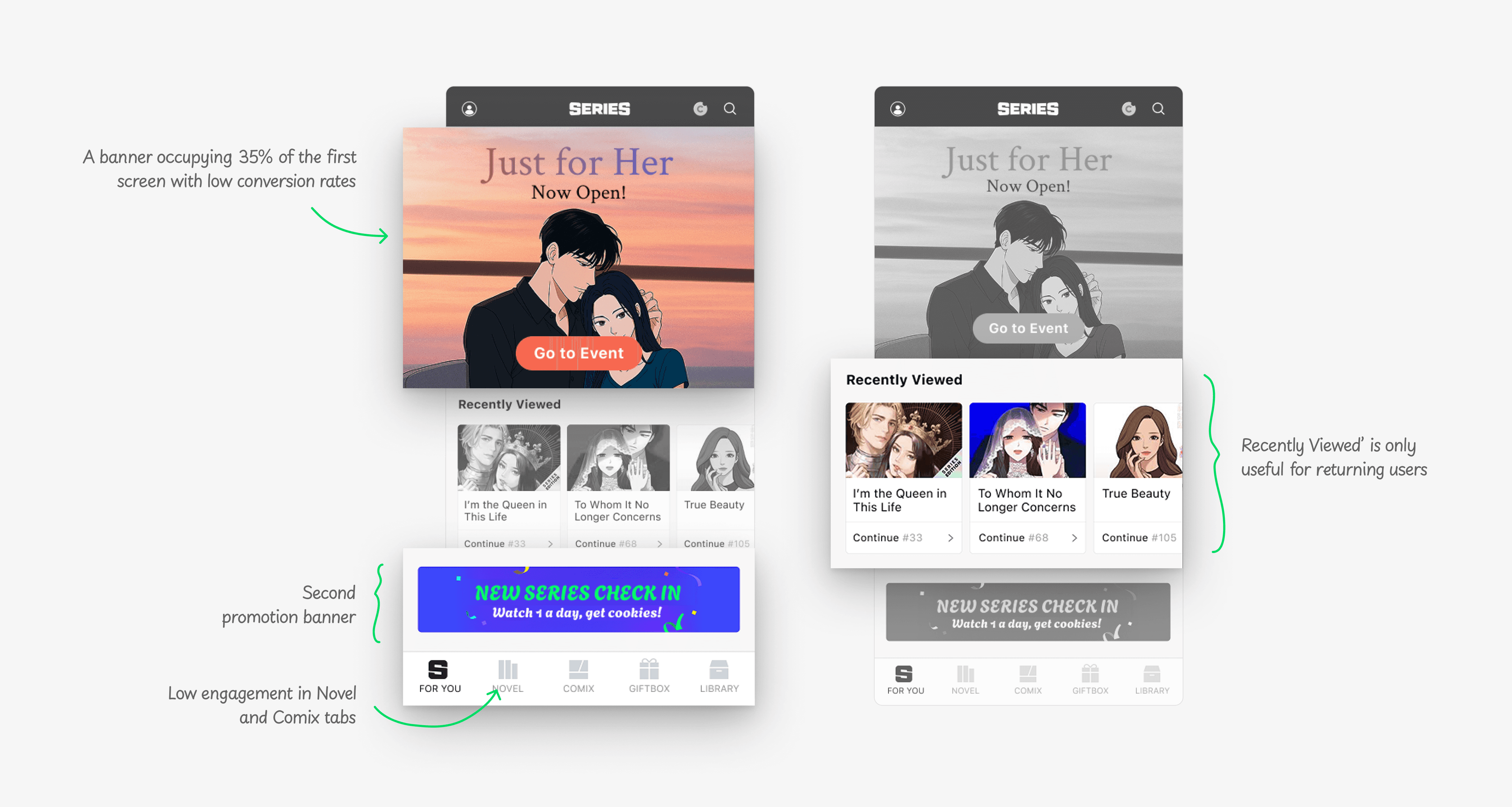
Lack of Ranking Circulation
The static, sales-driven ranking kept the same top titles in place for hours, preventing new or niche contents from gaining exposure and severely limiting discovery opportunities across the platform.
Lack of Ranking Circulation
The static, sales-driven ranking kept the same top titles in place for hours, preventing new or niche contents from gaining exposure and severely limiting discovery opportunities across the platform.

User Research Insight: When and Why Do Users Discover New Content?
User Research Insight: When and Why Do Users Discover New Content?
Through in-depth user interviews, I uncovered three core discovery patterns that explain when and why users explore new titles. These insights directly shaped our three main solution directions.
Through in-depth user interviews, I uncovered three core discovery patterns that explain when and why users explore new titles. These insights directly shaped our three main solution directions.

Phase 1 : Home
Phase 1 : Home
Design Exploration: Making Home More Engaging
Design Exploration: Making Home More Engaging
Showing Familiar Content
I explored compact “Recently Viewed” cards, inspired by Instagram Stories and YouTube subscriptions, to help users quickly recognize familiar titles with minimal information. The goal was to make ongoing content easier to resumewithout overwhelming the Home screen.
Showing Familiar Content
I explored compact “Recently Viewed” cards, inspired by Instagram Stories and YouTube subscriptions, to help users quickly recognize familiar titles with minimal information. The goal was to make ongoing content easier to resumewithout overwhelming the Home screen.

Presenting New Recommendations
To make new recommendations more visually engaging while still informative, I explored variations inspired by Netflix and Webtoon patterns. The goal was to find the optimal balance between visual pull and information density.
Presenting New Recommendations
To make new recommendations more visually engaging while still informative, I explored variations inspired by Netflix and Webtoon patterns. The goal was to find the optimal balance between visual pull and information density.
Phase 2 : Ranking
Phase 2 : Ranking
Design Validation: Optimizing Ranking Placement for Faster Discovery
Design Validation: Optimizing Ranking Placement for Faster Discovery
I tested two prototype variations to validate where ranking features should live within the navigation structure. Since rankings play a major role in how users discover trusted content, I needed to confirm which placement would surface rankings earlier and accelerate exploration.
I tested two prototype variations to validate where ranking features should live within the navigation structure. Since rankings play a major role in how users discover trusted content, I needed to confirm which placement would surface rankings earlier and accelerate exploration.

Phase 3 : Navigation
Phase 3 : Navigation
Design Validation: Reducing Cognitive Load in Content Switching
Design Validation: Reducing Cognitive Load in Content Switching
I tested multiple navigation models to understand which structure helped users switch between Novel and Comix content with the least effort. Since overall content discovery was declining, it was essential to validate which design reduced cognitive load and aligned with users’ natural switching patterns.
I tested multiple navigation models to understand which structure helped users switch between Novel and Comix content with the least effort. Since overall content discovery was declining, it was essential to validate which design reduced cognitive load and aligned with users’ natural switching patterns.

Final Design
Final Design
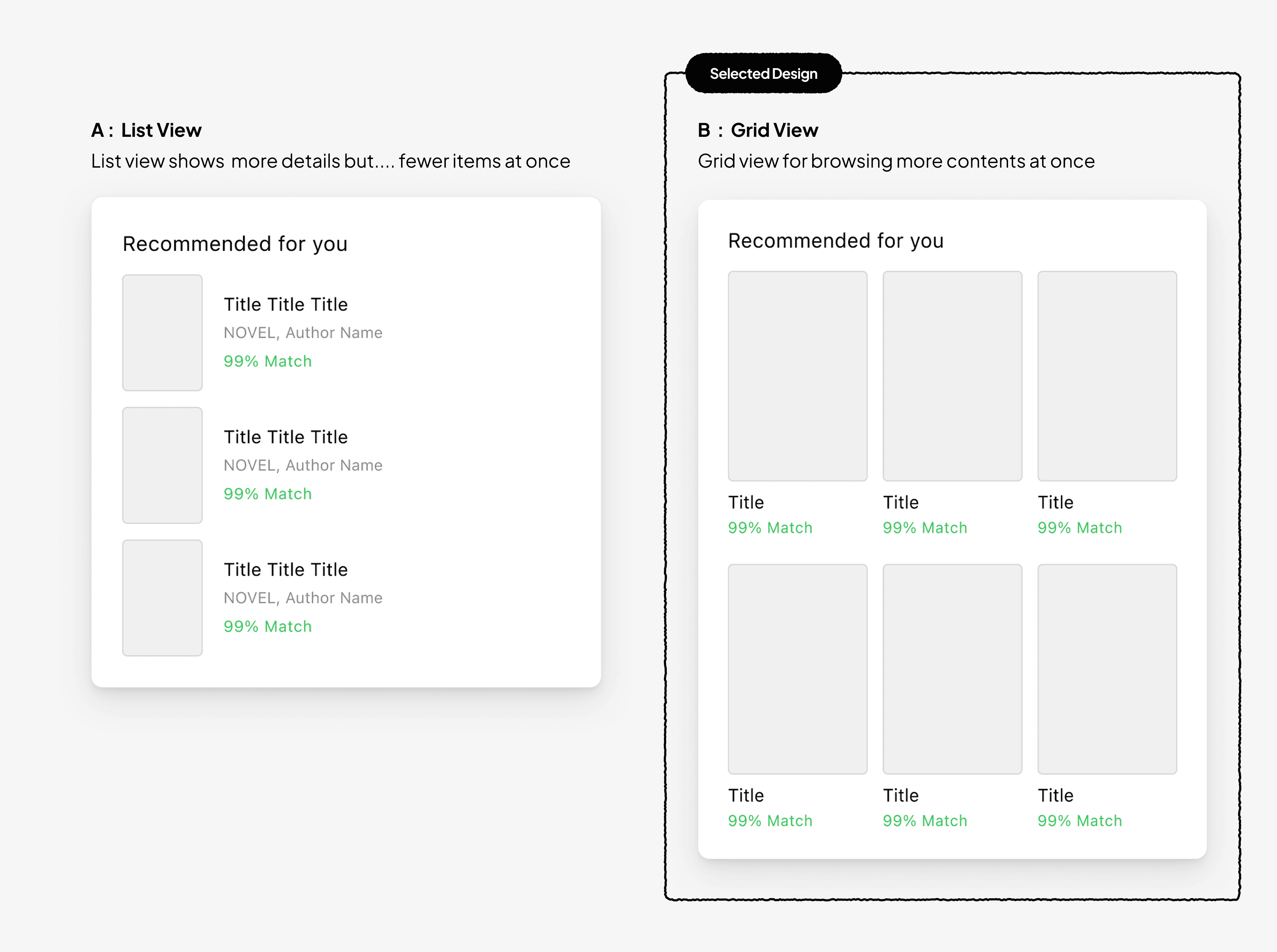
Enhancing the First Impression of the Home Screen
Enhancing the First Impression of the Home Screen
The old Home showed almost no new content, keeping users in existing reading patterns.
I improved the information hierarchy by reducing noise and elevating new-content sections, and added a top level “Recommended for You” module to boost early discovery.
The old Home showed almost no new content, keeping users in existing reading patterns.
I improved the information hierarchy by reducing noise and elevating new-content sections, and added a top level “Recommended for You” module to boost early discovery.

Expanding Exposure to New Content
Expanding Exposure to New Content
User research showed that ranking visibility is key to new-content exploration. I redesigned the ranking experience with clearer categories (Trending, Best, New, Age Group) and genre-based submenus for richer navigation.
A poster-style layout makes new titles stand out, helping users find fresh content faster and with less effort.

Easy Mode Switching for Two User Groups
Easy Mode Switching for Two User Groups
User testing showed strong positive reactions to the Home toggle. Because it adapts to each user’s most recently viewed mode, both Novel-focused and Comix-focused users switched with no confusion.
Compared to the previous tab navigation, the toggle reduced cognitive load and increased cross-engagement between the two groups.

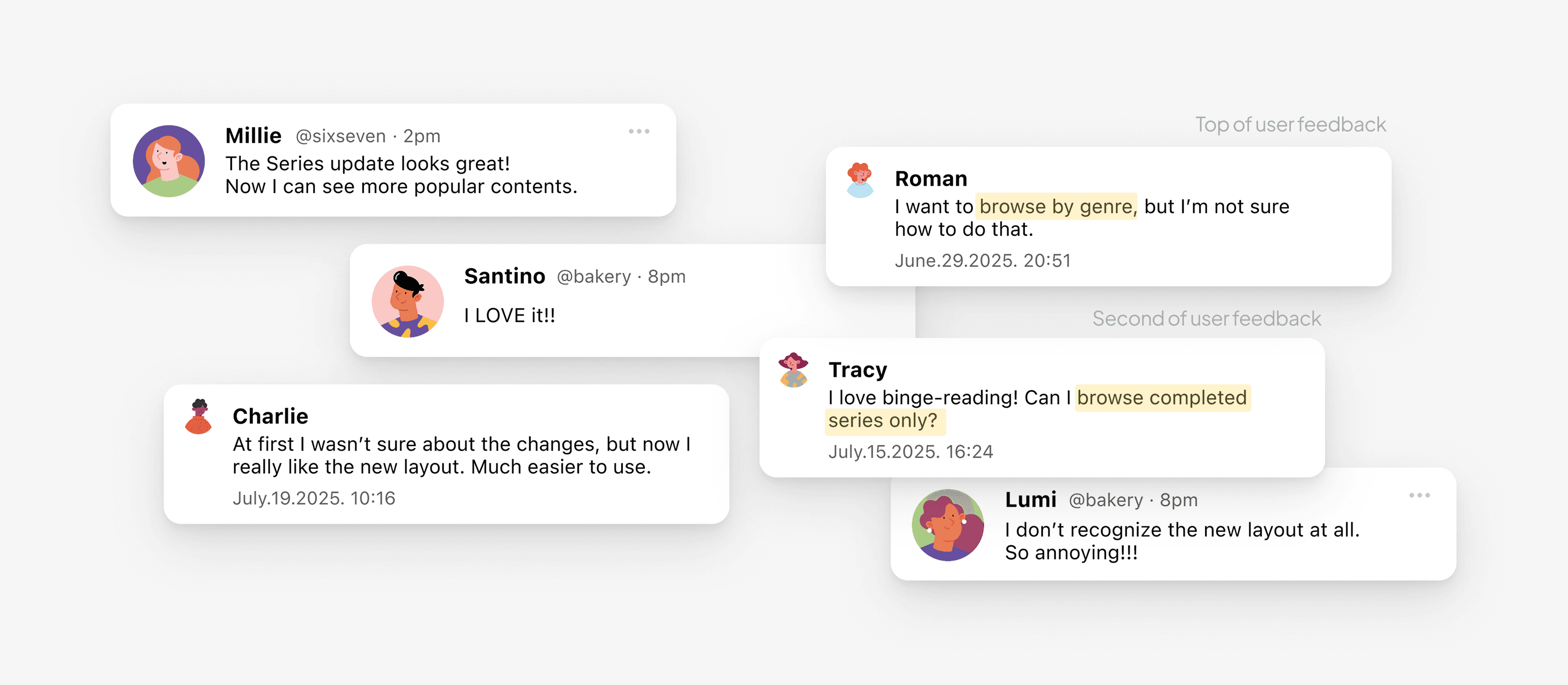
User Feedback
User Feedback
For a month after launch, I monitored feedback across channels. Aside from a few comments about learning the new layout, overall response was very positive. Users highlighted the clearer hierarchy, better new-content access, and faster navigation.
I organized feedback themes and prioritized high-impact follow-ups.
Result & Impact
Result & Impact
After Phase 3, all key performance indicators showed strong improvement. The redesign drove +29.5% clicks per title, +14.7% new-content views, and +11.5% purchases, boosting overall revenue within a month and proving clear UX and business impact.
After Phase 3, all key performance indicators showed strong improvement. The redesign drove +29.5% clicks per title, +14.7% new-content views, and +11.5% purchases, boosting overall revenue within a month and proving clear UX and business impact.
29.5%+
29.5%+
29.5%+
Click per content title
Click per content title
Click per
content title
14.7%+
14.7%+
14.7%+
New content views
New content views
New content
views
11.5%+
11.5%+
11.5%+
New content purchases
New content purchases
New content
purchases
Next Case Studies
Next Case Studies
UX Designer · Public Release
Redesigning Restaurant Search Results to Improve Decision-making
Redesigning Restaurant Search Results to Improve Decision-making
UX Designer · Public Release