Redesigning Korea’s National Subway Map
Used by Millions Every Day
As the UX Designer, I redesign of Korea’s national subway map to resolve structural inconsistencies and geographic inaccuracy. I owned the full process—from global benchmarking and system formulation to map design, validation, and nationwide rollout.

Product
Platform
Role
Timeline
Problems
The previous map lacked a unified system, causing visual inconsistency, geographic distortion, and a structure that broke every time new lines were added.
Goals
Establish a scalable, rule-based design system that restores geographic accuracy and ensures clear, consistent visual standards across all lines.
Result & Impact
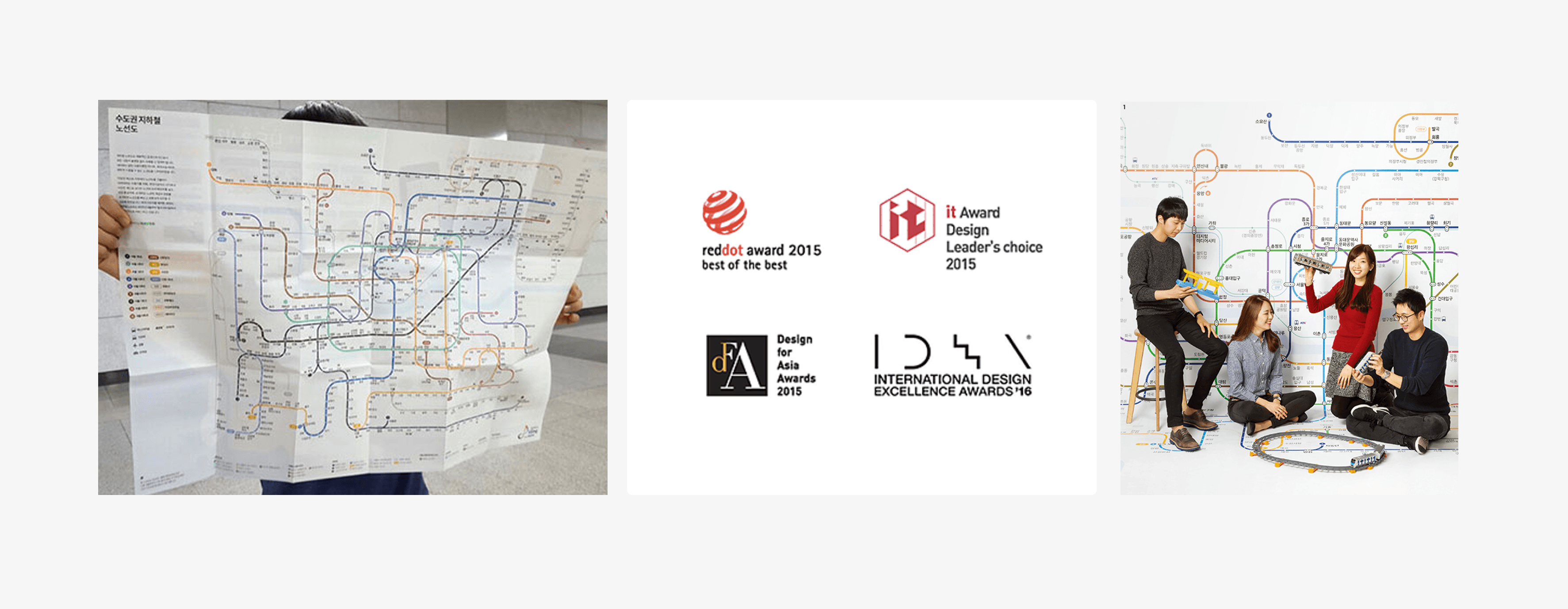
The redesigned subway map evolved into a clear, accurate, and scalable system that was deployed nationwide, earning four major awards, including the Red Dot Best of Best and resulting in 19 patents.

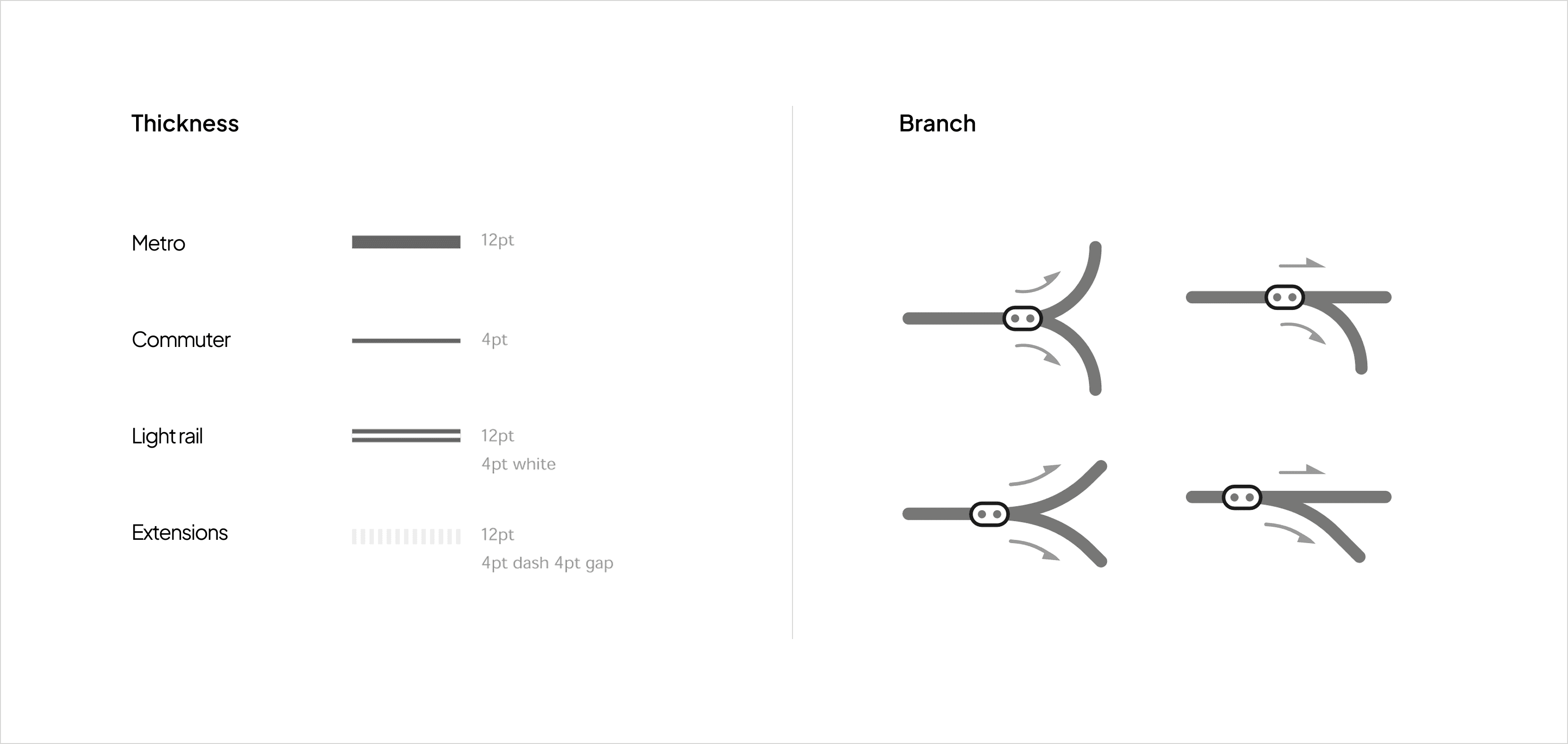
Lines
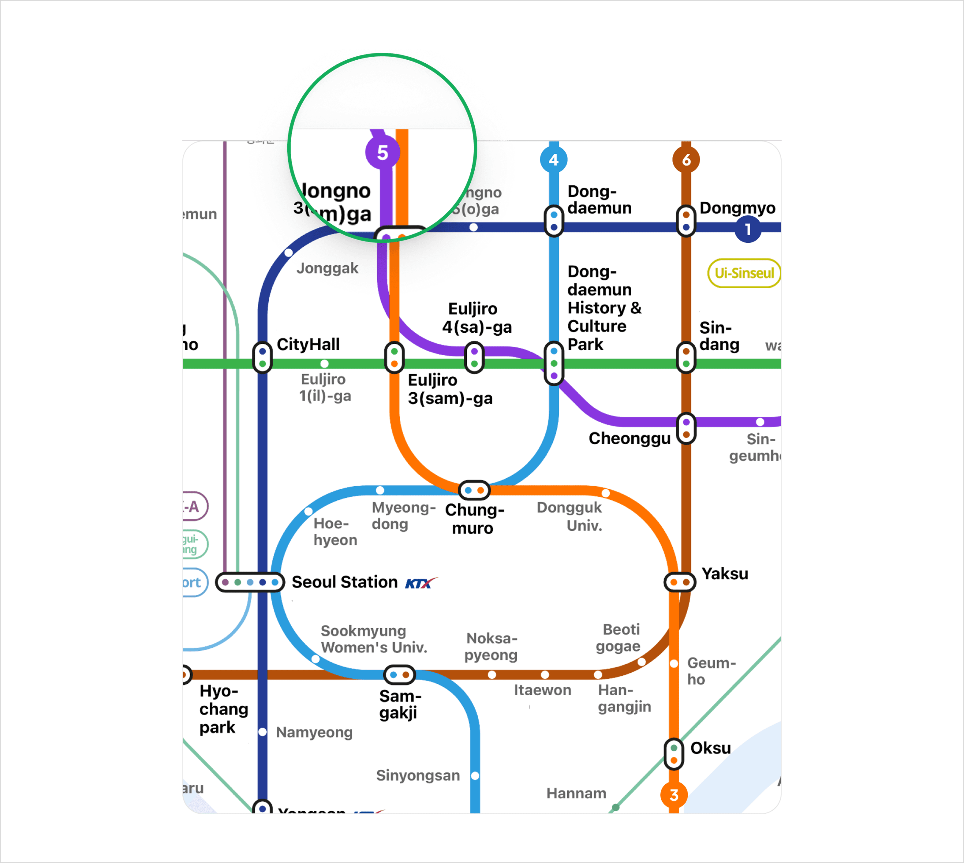
Use differentiated line weights for main lines, express routes, and branches to support instant visual recognition.
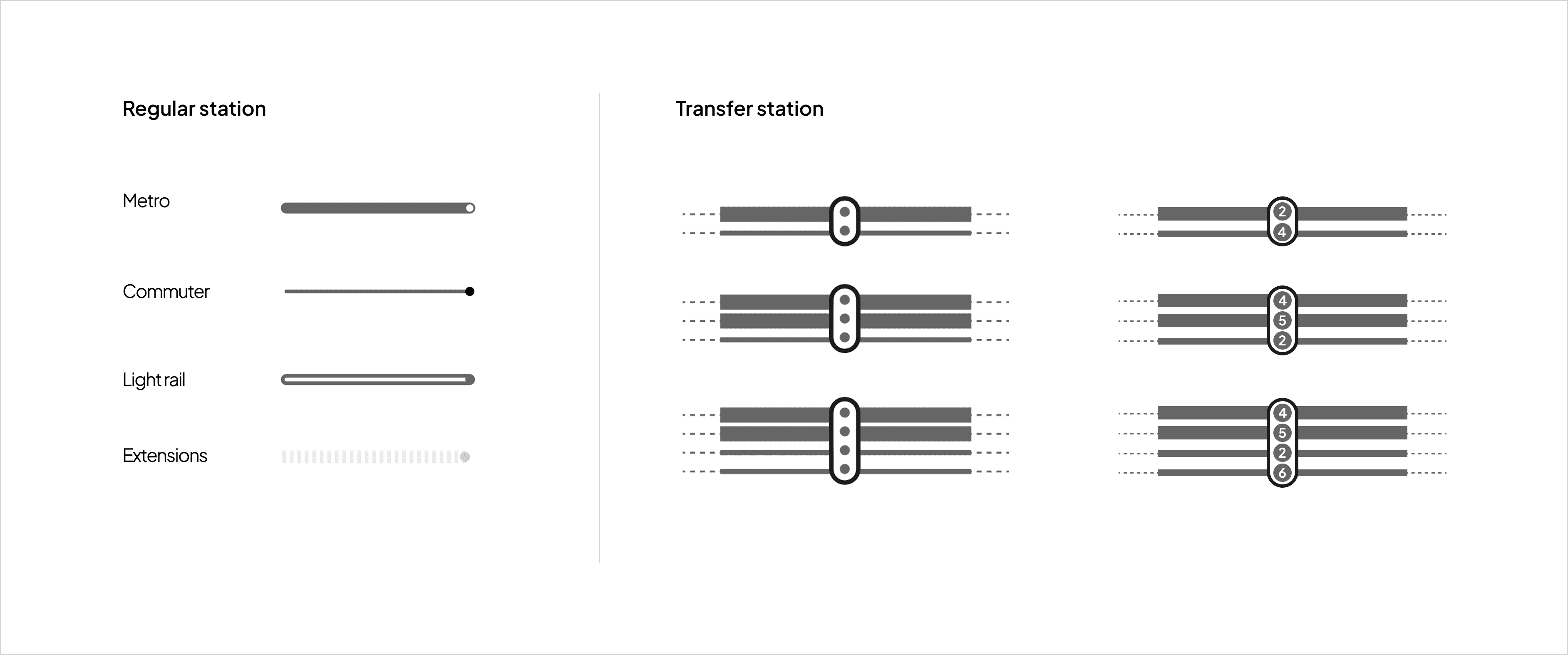
Stations
Define distinct shapes for regular stations, major transfer hubs, and terminal stations to reflect hierarchy and function.
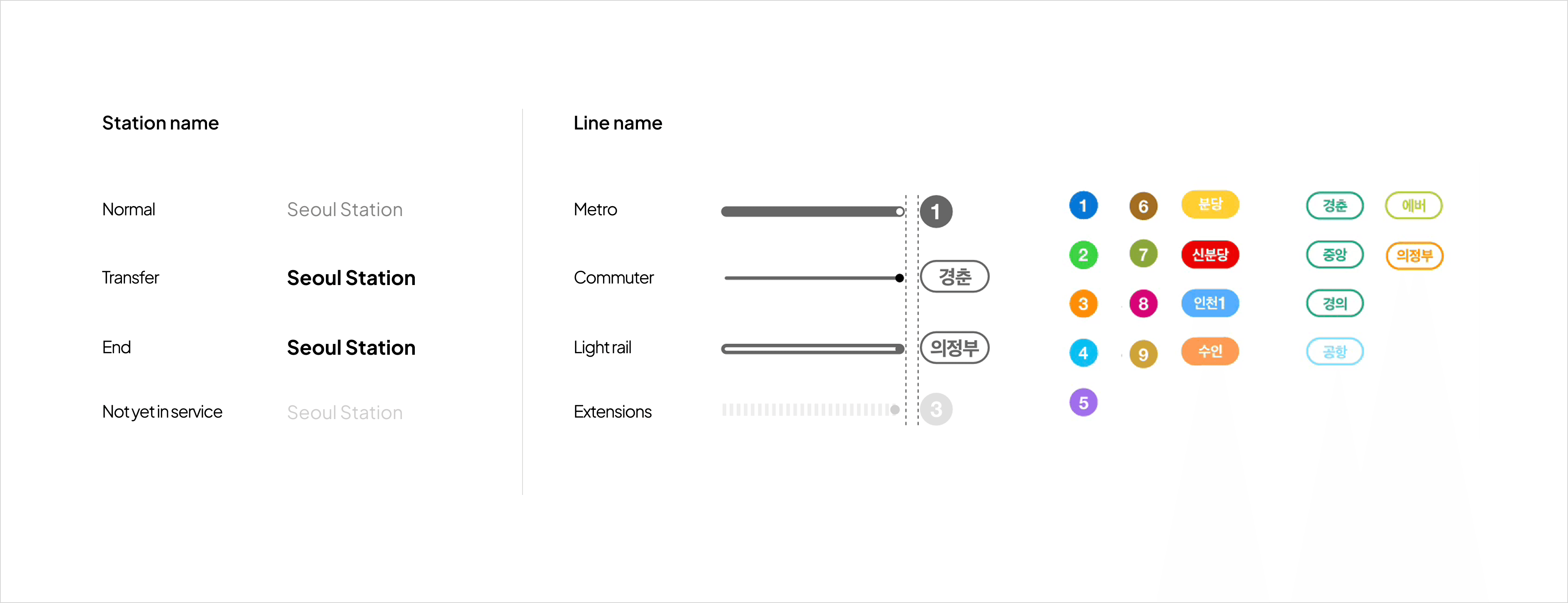
Labels
Apply variable label weights and spacing based on station importance and density to improve clarity in crowded areas.
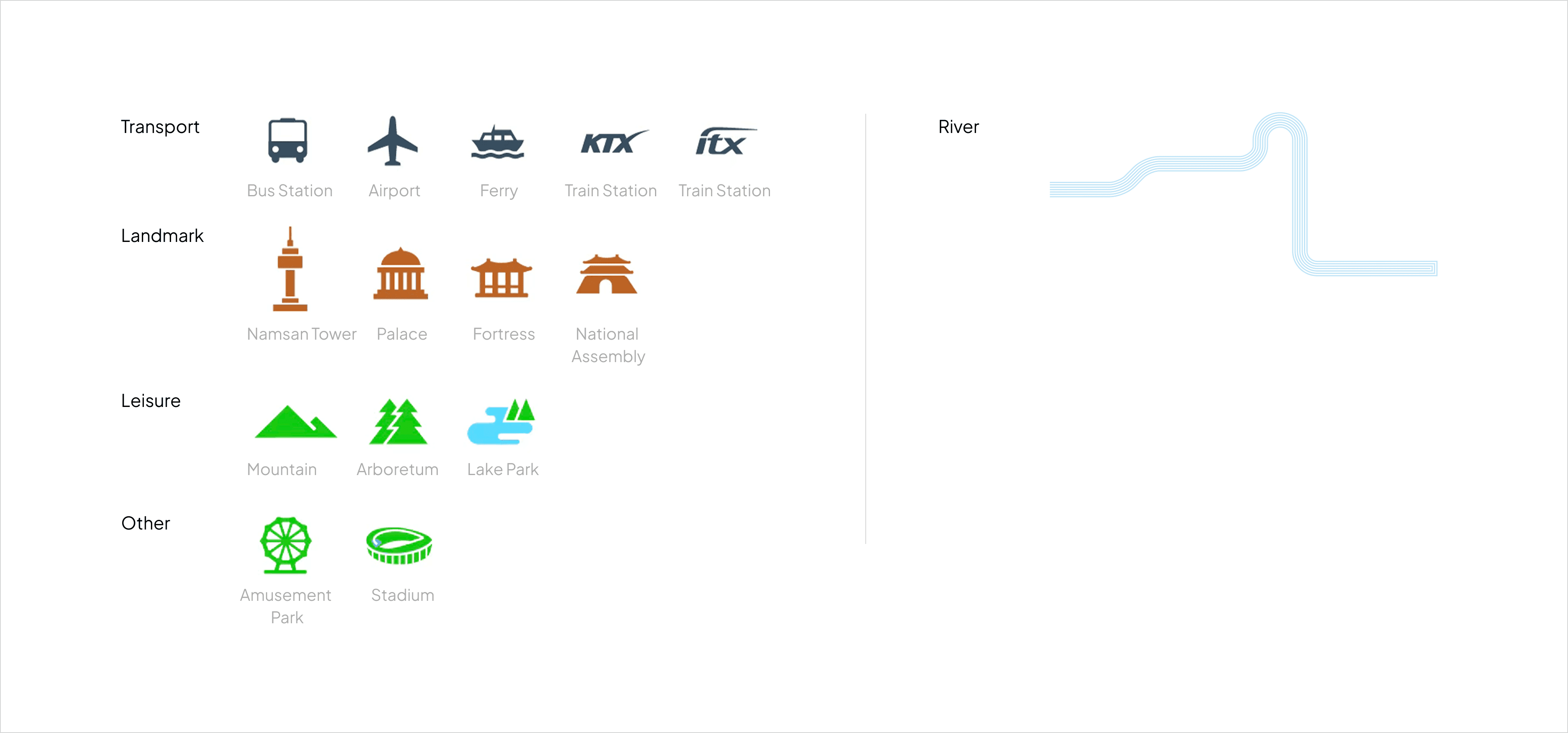
Symbols
Use simplified pictograms for transportation facilities and landmarks to ensure quick recognition across zoom levels.
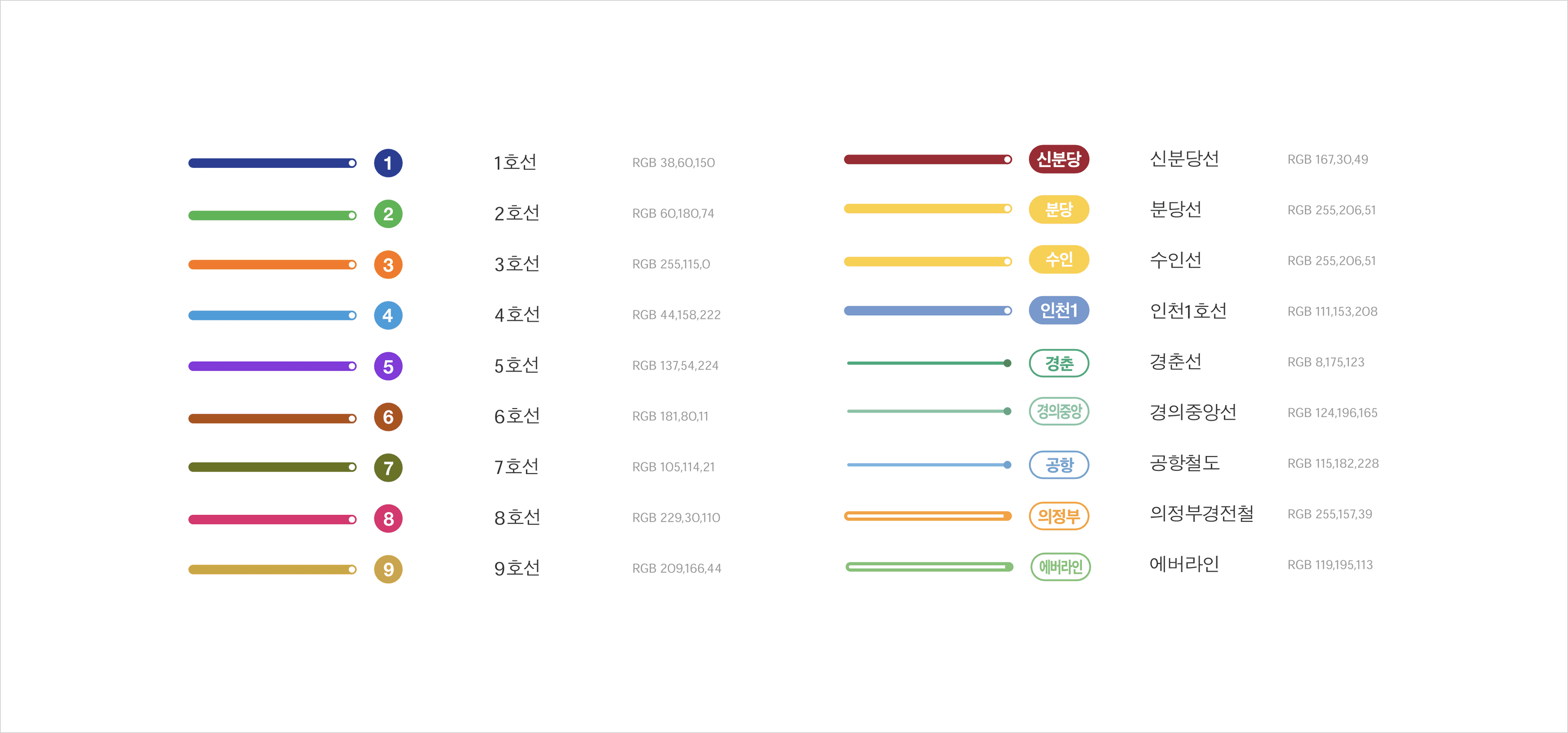
Colors
Use a controlled and consistent color system that remains perceptible across devices while reducing visual clutter.
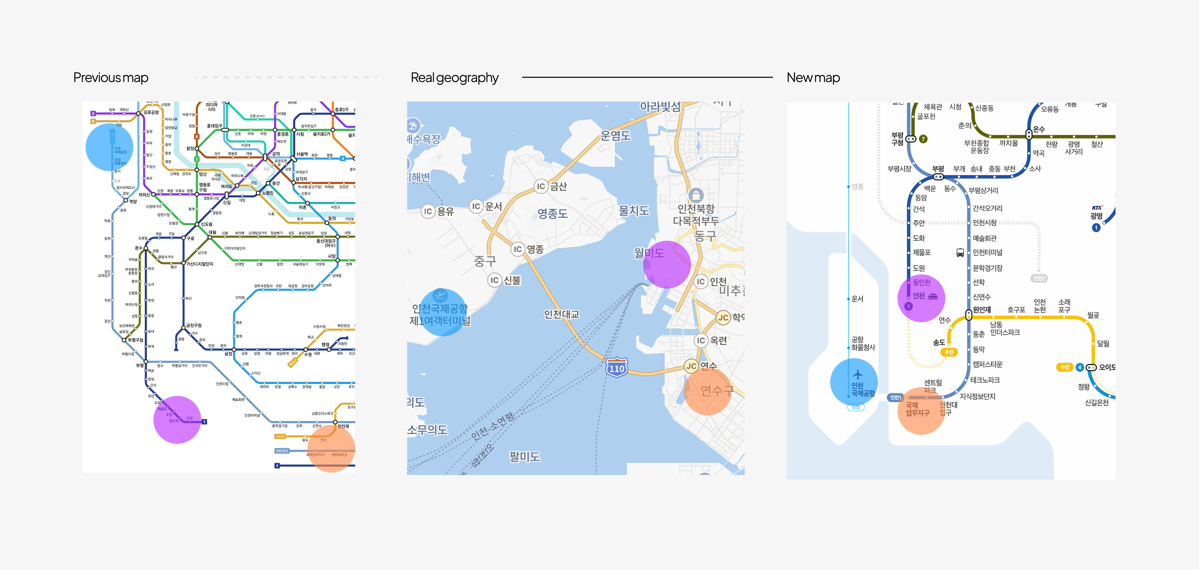
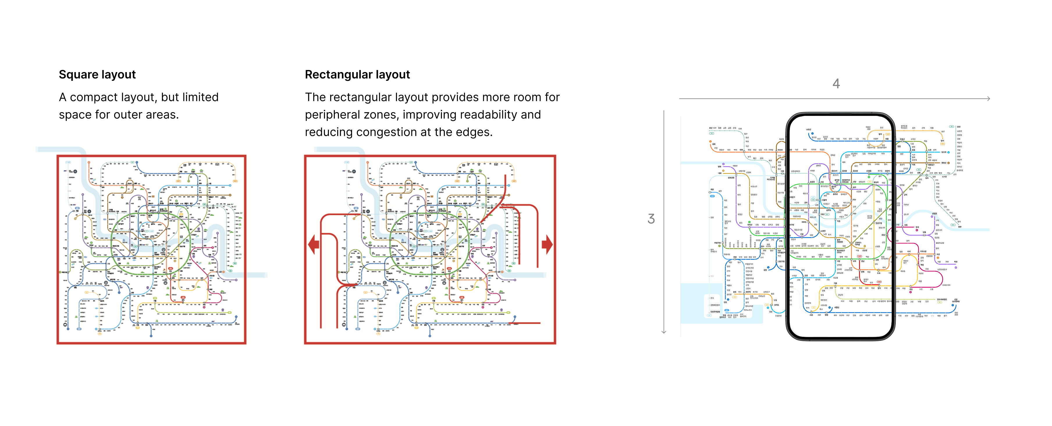
Layout
Align line geometry with real geography while reducing unnecessary distortion to help users estimate distance intuitively.